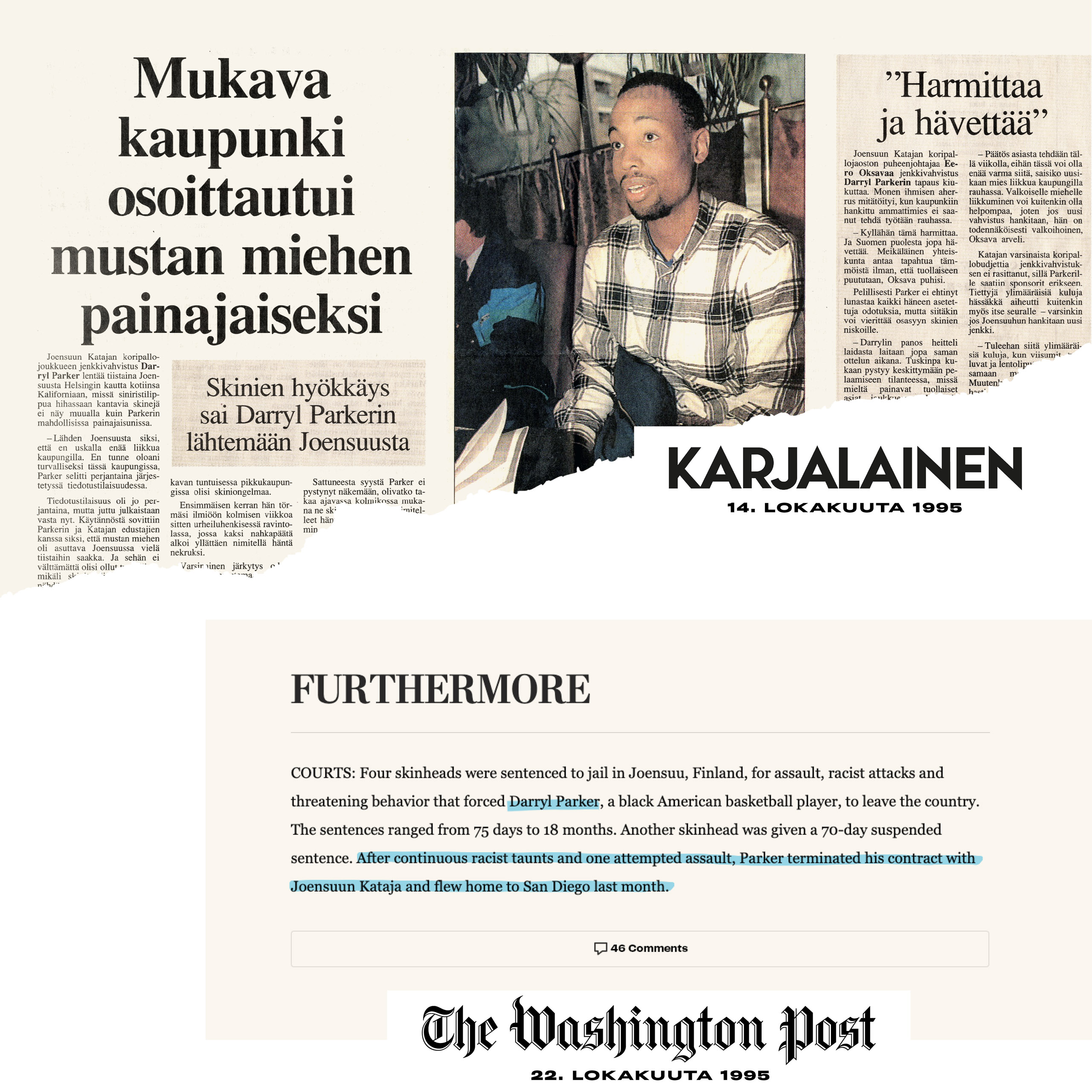
Starting point When Kataja Basket started 70 years ago, not many had high hopes for a basketball team from Joensuu. Local racism caused additional trouble during the 90s and labelled Joensuu as an intolerant city. However, the people of Joensuu understood the unifying nature of sport and consciously investing in the team showed results. Kataja grew into a regular participant of the Euroleague, a Finnish champion as well as a high-flyer in the Finnish Korisliiga. For the anniversary season, the identity was decided to match the ambitions of the team, the club and the whole community all alike.
Solution The people of Joensuu could have given up but instead they decided to act – to move forward! Kataja brings Joensuu out to the world and the world to Joensuu. The club opens doors to the wide world for both the players and the fans with a truly global sport. Sport has an immense power of connecting people regardless of age, gender, religion or nationality. The purpose of Kataja Basket is loud and clear.
“To make Joensuu more international with collective actions “
The purpose behind Kataja Basket
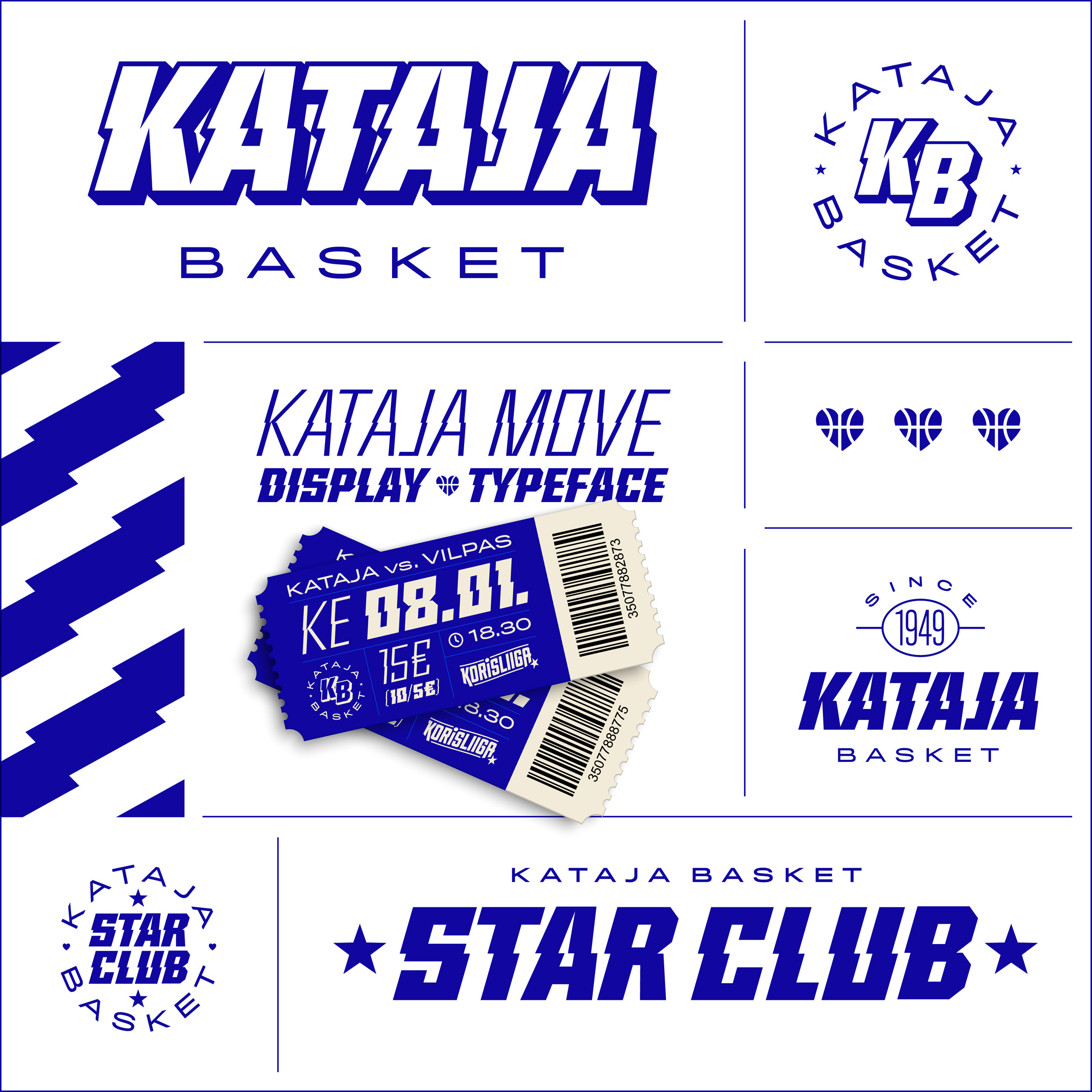
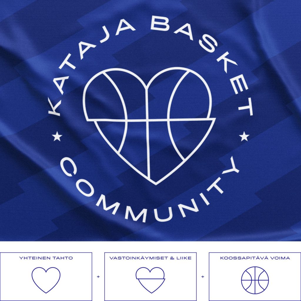
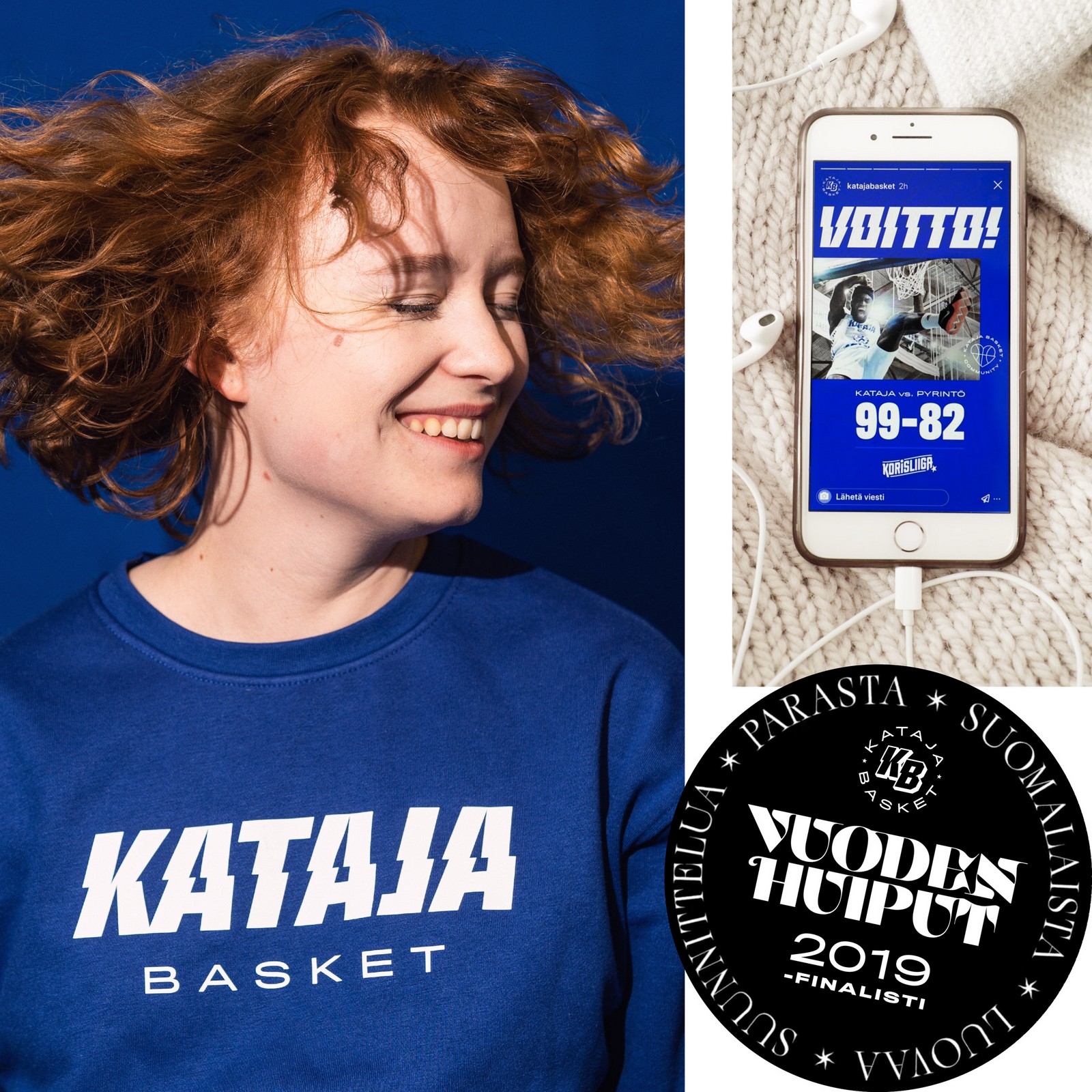
Execution The identity is implemented as a fresh visualization. Diversity of the visual identity is built whole with the Move element. The design language of Move can be seen in the logos, patterns and frames as well as in the distinctive Move display typeface, which is utilized in the player uniforms’ numbers and striking headings. Their purpose is also shown with well thought-out usage of the English language. The community emblem was created as a symbol of togetherness. The integrity of a such a diverse group is not self-evident, but Joensuu’s love for basketball is what keeps it intact.
Interested?
Voit jättää yhteystietosi tai me olemme auttamassa.